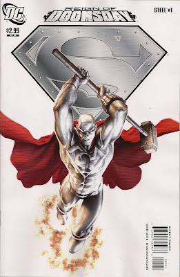
The good news: Steel gets his first solo appearance in years.
The bad: we won't be seeing another anytime soon.
I like Steel. Inspired by Superman, John Henry Irons built a metal super-suit and went toe-to-toe with the worst Metropolis had to offer while the Man of Steel was dead/growing a mullet. In this one-shot he steps up again, when Doomsday - whose murder of Superman got him into the hero game - shows up in Metropolis. No one thinks Steel has a chance, not even his niece Natasha.
They're wrong. He has a chance. It just doesn't pay off, when Doomsday evolves to cope with whatever Steel throws at him. Even an ever-changing Doomsday, though, is a boring Doomsday: he rampages, he grunts, he manages the odd word ... he's not got one iota of the charisma of Luthor, Brainiac or Mr Mxyzptlk. Even the Prankster is more entertaining. Doomsday is deadly all right - deadly dull.
Tedious as he is, Doomsday takes over the comic that was originally intended to be Steel's big comeback and by the end of the issue our hero is dead. Spelt 'dead'. Natasha thinks he's popped his clogs - she's stuck in a homage to Superman #75 - but we've merely seen him black out. If he is dead, well, some handy 'nanobytes' - titchy intelligent robots - will provide a speedy route back.
Making his American comics debut, Doctor Who novelist Steve Lyons steps into the DC universe with ease. While Natasha seems a little off with her extreme lack of faith in her uncle, the attitude serves the story, helping to build a sense of doom. And I wouldn't be surprised if it plays to a character arc, as a step towards her reclaiming the Steel armour she once wore and going to war on Doomsday. Steel's voice - we're in his head as he faces Doomsday - is spot-on: analytical, cautious, very human. I'd like to see more DC work from Lyons ... and it'd be nice if he weren't required by an 'event' to see off his hero.
Ed Benes, on pencils and inks, does a good job of making Doomsday look imposing, a threat to the hero, while giving Steel plenty of great visual moments. I like how he draws Steel's armour, and he captures the striking Natasha's intelligence. Blond's colour palette is perfect for an explosive battle in an urban setting and Pat Brosseau letters with class, as always.
The DC Icons cover, by Alex Garner, captures the power and majesty of Steel and is as solid an argument as any for bringing the character back, and soon.
The Reign of Doomsday four-parter continues in the dependably rubbish Outsiders, where the team will no doubt be roundly bashed. Actually, I may buy that ...

In a nutshell - Art great. Plot Thin. Script decent. A more powerful, sexier, but strangely watered down Doomsday beats Steel in a knockdown fight that lasts faaar longer than it had any right to - and that's it. Review over.
ReplyDeleteWell, okay.
I thought it was 'okay' but nothing that sticks in the mind, very much a Marvel comic of the oldschool in fact.
The plot such as it is is very forced - all the heroes are out of town apparently(?!) so in a moment of madness in jumps Steel to singlehandedly take on a monstrous opponent who has the singular and unique feat in the DCU in being the only one capable of beating Superman to death in a sustained fight.
Think on that. It's a ludicrous notion. Made even more surreal by the sight of Steel actually somehow lasting a good long while in pitched combat with this now augmented brute.
No, look let's not analyse this book any more than it warrants, it filled it's pagecount and was a decent enough but also lightweight read. Sorted.
It is a shame. From what I've read Steve Lyons took on the gig, had a story in mind, THEN was told he had to write the first instalment of a Doomsday event.
ReplyDeleteAch, you likely know that, Dave. Anyway, I'm sure the book would have been more satisfying had Lyons been given more leeway. For what it is, I found it pretty decent.
Nothing specific to this comic, but I find DC's "inconic" covers pretty, pretty boring. But that's just me
ReplyDeleteI've liked all the ones I've seen, though I'd always rather have a strong, grabby scene from the issue. With word balloons. And blurbs. Maybe a starburst or two ...
ReplyDelete