This is a fresh start, and Carol has nothing to prove. She's an experienced Avenger with awesome powers at her fingertips. A brief team-up with Captain America displays an easy friendship between the Forces veterans - she Air Force, he Army. They barely need discuss tactics to take down the Absorbing Man, but the banter makes for a satisfying opening scene and tells us they're very much equals.
And it's Cap's respect for Carol that leads her to take on the mantle of Captain Marvel, after years of letting herself be seen as, in his words, 'an adjunct'.
Out of costume, Carol herself is giving out encouragement, helping Tracy Burke, an old friend from her journalism days, as she deals with cancer. The other story thread takes us to the past, showing how tyro pilot Carol met mentor Helen Cobb, record-breaking flier.
Writer Kelly Sue DeConnick gets this book off to a great start, with a script that nicely balances action with recaps and hints of things to come. The dialogue is smart and natural, as she emphasises Carol's status as a woman born into the Air Force life. DeConnick shows us how, for Carol, handling planes compares to flying under her own Kree-power. Best of all, she makes Carol likeable and fun, someone I want to get to know again.
The interior art by newcomer Dexter Soy is a shock after the super-clean, ultra-bright cover; the first impression - as Carol and Cap battle the Absorbing Man - is one of murkiness. Soy is handling the full art job, which is impressive, but the colouring here doesn't work - he gives Carol and Cap a sickly green tinge to their skin tones.

Things get better all round in the civilian vignette with Tracy (below, click to enlarge). Carol's face can be seen clearly, and a quiet strength and compassion is evident. And Soy pulls off the little moments that add magic to a domestic scene. The flashbacks are impressive too, with a younger Carol dreaming not of life as a superhero, but as a flier.
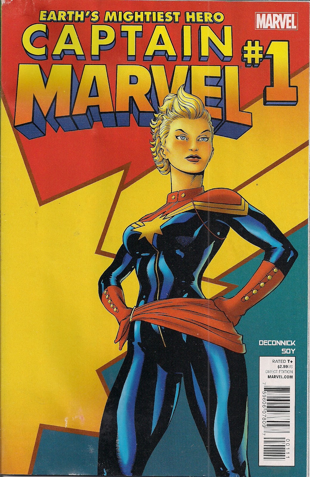
So yes, I didn't love every aspect of Soy's work, but I'm optimistic that he's only going to get better as he sees his art in print, notes what works and what needs a tweak or two. There's a sinewy, Earl Norem quality to Soy's metahumans that's interesting. He draws Carol's new outfit well, barring the horrific headpiece and utterly bonkers new hero hairdo. Marvel needs to dump both as soon as possible ... Ed McGuinness and Dexter Vine's cover show how much nicer a bare-faced Carol looks - open and heroic, whereas Kree helmets never look anything less than sinister.

Sounds good! Would love to see examples of Dexter Soy's work...
ReplyDeletePics added!
DeleteAll Marvel books are a hard sell for me; I can't afford getting caught up in a second universe. So the potential sale they lost was only the slightest of potentials.
ReplyDeleteBut man, any thoughts I had of picking this up were dashed when I opened it up. Instead of the crisp, clean art this book was marketed with, Soy's painted work (reminiscent of Marvel's glum Ruins and DC's Cry for Justice) turned me off completely. Not at all my style, and not what any of the marketing (the cover, the Astonishing Spider-Man tie-in) seemed to promise.
I'm glad the story is decent, but I'll check out DeConnick's Ghost for Dark Horse instead.
I prefer the clean look, definitely, but I'm going to be optimistic ... given the turnaround of artists in comics these days, there'll likely be a swap soon.
DeleteHopefully he'll find something he's better suited for, and Marvel will find an artist better suited for Carol. Or even better, it will be a raging success and Marvel will actually start to market the character with his art, instead of pretty much the exact opposite of it.
DeleteBut as I said, I didn't read the story, so what do I know?
You know what you like, which is pretty darn relevant! Next issue's cover is similarly non-representative of the inner art, it's that Rosie the Riveter homage. In the lettercol - and bless this book for having one - editor Stephen Wacker says Dexter Soy's work helps the book stand out, which is inarguable. He then shows bits of fan art inspired by Jamie McKelvie's new look for Carol, and it's all lovely and sharp and bright too.
DeleteMs. Marvel is probably my fav female superhero. Good stuff.
ReplyDeleteHave you seen this post from Blog Chum Paul at Longbox Graveyard? It's a nice reminder of the Carol that was:
Deletehttp://ht.ly/ckKlK
So is this a new reboot of Carol's origins? Or a separate continuity?
ReplyDeleteIt's a continuation, Miguel - no reboot at all; supporting character Tracy comes directly from the Seventies series, and her psychomagnotron origin is seen.
DeleteI just wonder if they'll explain the new costume, and what villains she'll be facing
ReplyDeleteI'm not sure there's anything to be explained - perhaps she's just changing her look - after all, when she donned the Cockrum outfit, that's all there was to it.
DeleteIt was a very expensive comic-book week for me, but I added this to the stack anyway, mostly based on your review.
ReplyDeleteWhen I read it, I was really glad I listened to you!
(Guess I'll wait yet one more week for the third part of Century.)
Glad you like the book, Hoosier X!
DeleteIs that the League of Extraordinary Gentlemen Century 2009? Or something else? If it is LoEG, I didn't even realise it was being serialised, I bought it cheap on Amazon.
When I first saw the cover in advanced solicitations, I thought 'ugh'. I thought the costume looked unremarkable and that the hair looked too prim and unsexy (compared to the tumbling mane that she had as Ms. Marvel).
ReplyDeleteBut the cover was really false advertising in a way. Because I thought the art inside was amazing! And to think that Soy does not just the pencils and inking but also the colours too (although I suspect he does the 'inking' digitally at the same time as doing his painted-effect colours).
I was so impressed with the art. This guy Soy is a real find in my book and I feel compelled to follow this book now!
That's awesome. I feel exactly the opposite -- I like the cover, but can't stand the interiors -- but I can't help but feeling that Marvel mismarketed this book in that regard. Why on earth isn't Soy's art -- or cover work in a similar art style -- being made more prominent so fans like you know this book exists? I feel like Soy's work wasn't promoted enough here.
DeleteIt's one thing to have a different artist draw the cover for your book. But it's so striking and so different from the interiors, Marvel should have really made some work by Soy just as prominent.
Hello Rob and Rob. I agree that Soy has something - I'd love to see him coloured by a full-time colour artist, to see how the art would look. Cleaner and better, I shouldn't wonder.
DeleteAnd I agree, Rob, that Marvel should marry the cover art to the interior.
Loved the book but then I loved Reed's stuff at first too and look at the unlikable bitch he turned Carol into. I dropped Ms Marvel Volume Two even before Dark Ms Marvel took over. I did like the returns of Tracey and her brother and found myself not as distracted by the costume as I expected to be. I'd just lose the yellow on the gloves and coming out of the star emblem. Oh and the best thing they can do with that wonderful old costume is give it to a new Ms Marvel, one hopefully more well thought out than her previous replacement...
ReplyDeleteSo very ditto, as regards the way Reed's Ms Marvel run went - I don't blame him so much as the editorial bigwigs who pushed Carol down a certain track, though.
DeleteThinking on, didn't Carol recently turn over her first costume to Ultragirl? I really don't want to see anyone else wearing her Cockrum look - it's the classic, and she'll be going back to it sometime, I reckon.
I cant say I like the artwork...too earthy for me, but being a long-time Ms. Marvel fan from way back, I shall definitely be sticking around for the strong, defiantly feminist Carol. Ive been leaving feedback on another blog for someone who hasnt read her before and extolling her virtues; its reassuring that one of my childhood favourites hasnt diminished that much.
ReplyDeleteI bought every issue of her first comic back from 1977 [and that wasnt easy in the mail-order, comic shop deprived 70s] and completely adored her. Several years ago I delighted in buying her Essential Edition and wallowed for a wet weekend in nostalgia once again - reading the complete collection all the way thru its remarkable how consistent it is, with regards to charaters and sub-plots; theres real writing at work there.
I couldnt follow her exploits thru the 80s as Binary in the X-books...far too disperse and complicated to keep track of, but a few years back we got her second volume; after an encouraging start Carol let herself down with taking the wrong side during that Civil War debacle, and her remaining issues were obscufated with those annoying SHIELD agents and Moonstone replacing her as Ms. Marvel. An ignominous end.
And shes back....actually she never been away if this first ish is anything to tend the tale of the tape by. Shes strong, capable, cautious and the only true legacy to the original Mar-Vell. Considering Marvel comics marketed her as their answer to DCs Wonder Woman, shes done a pretty good job of it so far. She is surprsingly relatable in a world of hyped-up over-sexualized super females. I do love her.
And has anyone noticed the new logo has Marvel in the exact same style as the old British weekly Mighty World of Marvel? Another reason to love it, as this first issue has a completeness about it that makes it easy to read all in one.
ReplyDeleteI am so looking forward to getting this on a regular basis; that grubby art needs to go though.
'And has anyone noticed the new logo has Marvel in the exact same style as the old British weekly Mighty World of Marvel?'
DeletePretty much every Brit of a fine vintage, I expect - include Terence over in my blogroll (Mighty World of Bronze Age Marvel)!
You may just have persuaded me to invest in those Essentials, Karl!
For those in the thread looking for more of Soy's art, You can find him on DeviantArt. Personally I love his style and absolutely think he should have done the covers.
ReplyDeleteI mean, look at this.
Insane. Nice to see Marvel taking some risks with the style.
Oh wow, that's rather glorious. Thanks Glendon, I'll investigate some more.
DeleteThat *is* a gorgeous piece. And it would be a great advertisement for the art inside!
DeleteThe artist is good, but the samples I've seen lead me to think either "Vertigo" or "Uncanny X-Force-ish artist".
ReplyDeleteVery fair comment!
DeleteWow, you liked this one a lot more than I did!
ReplyDeleteAnd off to Comic Per Day Reviews I go ...
DeleteI like the art. Its a bit unusual, but i think it works. I like seeing one of my favorite Marvel heroes get an ongoing again, and the issue itself was good. I wasn't sure how her new identity would work out, but I'm liking it so far. Now, if only She-Hulk could get another ongoing....
ReplyDeleteI liked the writing. I think Kelly Sue DeConnick did an awesome job, but.. the art completely and utterly undermines her brilliant story. It's not just that it's murky, ugly and muddled at numerous points, it's that there are a number of obvious and open butt shots all over the place with odd shaped torpedo boobs, strange dresses that look like night shirts (even while being dresses), and low cut shirts intentionally there to show off her boobs again. I mean, Marvel is suppose to be building Carol up after that horrible Ms. Marvel title and this is their first female lead title in YEARS and I open it up to.. well obvious T&A scenes all around. The butt shots SERIOUSLY bothered me and kept taking me OUT of the story which is sad b/c I think the story is BRILLIANT. I mean there is a panel where we get Carol's butt 3 TIMES as she somersaults backwards which was insanely uncalled for. A couple pages before that, we see Carol ripping off her sash and her boobs are bigger than her head (literally drawing your eye to her boobs). Shortly after that, in the center of the page, is a shot of Carol's butt. Then later during the flash back scene, we get Carol in a shirt that just happens to be unbuttoned enough so you can see straight down into her cleavage. It was so distracting for me and I can normally ignore the T&A! I was just so surprised that there would be so much in the FIRST female lead comic Marvel's had in quite a bit.
ReplyDeleteGreat points. I think the best wee can say about the but shots is that at least they're equal opportunity - gee, Cap is peachy.
ReplyDeleteIt's especially impressive that the story turned out so well, given it was largely restructured ... did you hear Kieron Gillen chatting to Kelly Sue DeConnick on his new Deconstructed podcast? Fascinating.
And helpfully, Kieron posts the pages under discussion along with the podcast:
http://gillen.cream.org/wordpress_html/4196/decompressed-002-kelly-sue-deconnickcaptain-marvel-1/